Monday, 28 May 2012

Final product out come


Booklet Design.
For my final piece on the Foundation Diploma I am creating a published book and online book for parents based around their teenagers. 

Focusing on their insecurities they carry and hopefully from this book they will empathise and have more of a understanding. I am showing them from visual information that I have research and created my self.I have explored different page layout and set ups and I have learnt to use InDesign.


Distortion

Creating distortion of my face on Photoshop. At first I took pictures of my face squashed against a glass window and then in Photoshop I used the liquefy filter to stretch, enlarge and rink. Creating horrifying feature to represent an ugly feeling of discomfort. Inspired by the artist Chris Cunningham a video artist who created the short clip called Robber Johnny.   


Work by Chris Cunningham as he takes pictures of different parts of the body and them replaces them to create someone with has a really scary disfigurement. As he looks at distorting the beauty of someone, as people are very self involved. He like to create a shock. 


Branding

Own Branding.
My own logo, brand/name tag for all my work. I first created it for my portfolio pages, but now I am using it for my work was well. I have been changing the colour for each individual part as it sets with the page colour theme.


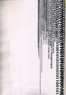
Researching an amazing Graphic Design company who work with typography. They are simply messages but so effective in just black and white, it almost seems as the objects and text are pieces of architecture.  


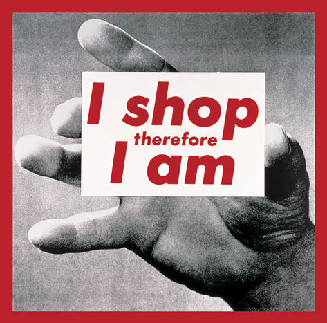
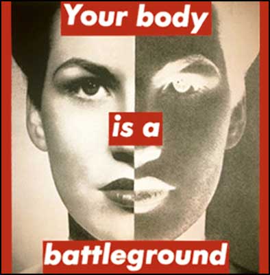
Barbra Kruger

Creating a visual response to Barbra Kruger's work adding my own theme and style, about young people and how they are judged and see by other people. Stereotyping.

Here are some examples of Barbra kruger's work an American conceptual artist. Nearly all her work are black and white photographs with catchy slogans or decorative cations placed on, in a vibrant red, which shows you the message clearly and it stands out from the gray scale images. 


Logo Design.
Creating a logo for the organisation N.E.E.T (Not in Employment, Education or Training)
It is based on young adults, a way of helping them find some stability and it lets them know people care.  
Exploring different colours for my logo and seeing what best fits.


Drawing onto the face.
Looking at creating a message to teenagers through a new creative way, exploring a message from one teenager to the next about their experiences and hopefully my audience will relate to my idea.


Friday, 4 May 2012

Yuko Michishita

Inspirational Artist


I first saw Yuko Michishita at the 'Pick ME Up' show at Summerset House in London, I fell in love with his illustrations. The detail in the typograohy is amazing. 

Thursday, 9 February 2012

Facial Experiments.

Experimenting with warping text around the face... hopefully moving on to projection onto the body/face and actually writing onto the face. Slowly moving into creating a motion advert with just typography drawings, giving awearness for NEET and the courage and determination for young people to always have hope.